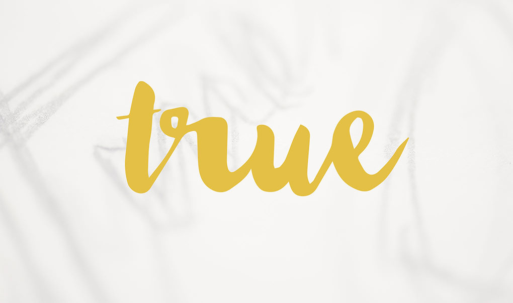
True To Type
Artist Sara Bang's studio isn't a studio at all.
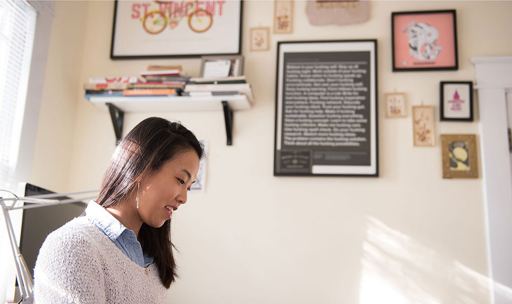
It's her bedroom, nestled in the back of the old-school bungalow that she rents on Chattanooga's North Shore. The space is cozy and neat: a bed, a desk, a printer, posters on the walls — two cats, lazily soaking up patches of mid-morning light.
Even in this quiet corner, it's clear that for Sara, this is just the beginning. The big studio, the big city — maybe they're waiting for her and maybe they're not. She says that the unknowns are scary and thrilling and invigorating, as they usually are for a talented, 20-something artist.
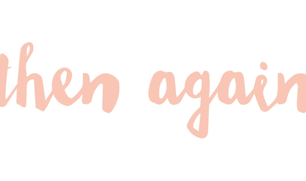
Then again, she's not a typical 20-something.
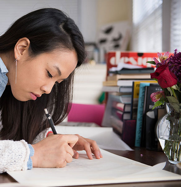
A graphic designer, Sara spends her days at Southside Creative Group, a downtown marketing firm. But in the quiet after hours, when the day is done, the office is closed and dinner is over, her room becomes her workshop. She sits at her modest desk facing the window, and here, she becomes letterer, calligrapher — an artist whose subject is always and never the same: the alphabet.
“My work is the combination of illustration and letterform,” Sara says. “I learned some basics in design school, but I became really interested in the anatomy of letters on my own.”
Her pool of freelance clients is growing: she's constantly creating company logos, organizational flyers, posters for local bands. But often, her work is still just for herself, her harshest critic, as she shapes the career that stretches out before her. It's not easy: lettering is a niche art. She self-teaches, and while her learning is guided by well-loved textbooks, those can only take you so far: a method can be taught; inspired creativity and commitment, not so much. Obviously, Sara wants for neither.
“The first few years of lettering for me was kind of chaotic simply because I didn't know where to start,” Sara says. “There was a lot of trial and error, and I made a lot of cringe-worthy stuff. But I slowly figured out the connection between the structure of letter forms and lettering work, and how they influenced each other.”
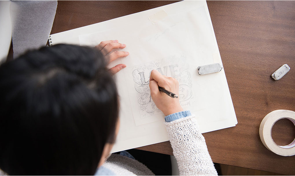
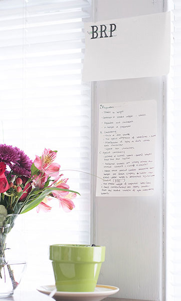
As she talks, Sara has two work samples at the ready. Both beautiful, yet wholly dissimilar; you would never know they were created by the same hand. The first: a small rectangle of cream-colored card stock, penciled with the words “Love is in the Air,” Every letter is painstakingly detailed and intricately embellished.
“It's just a sketch,” she says. But it's a sketch that required rulers and measurements, concentration and precision. Hours.
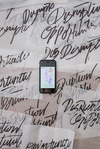
And it contrasts sharply with another piece Sara presents, a long, spiraling scroll of translucent paper. Written over and over, in flowing black ink, is a pair of words: “Opportunity/Disruption,” It's also a sketch, and in the more traditional sense: gestural, an organic stream of consciousness — no rulers or measurements here. Still, it's a process. She rewrites, and rewrites, she says, all the while thinking about the relationship between the words and how they best fit together — like a puzzle that she creates and solves herself.
“For me, this is actually harder,” she says of her free-flowing sample. “I'm a perfectionist. I like rules.”
Sara emigrated from South Korea with her family at the age of 16. A foreigner in the South — Cleveland, Tennessee — she knew no one and spoke no English. So she found comfort and familiarity in global, if not opposing, languages: math, whose principles don't alter by country or hemisphere; and art, whose rules are universal, or can be universally broken.
“I remember taking an art class back in Korea. I really didn't like art back then,” Sara says. “I thought I just didn't have any talent.”
But she tapped into it as a high school student in America and decided to pursue it at the college level. Unable to afford the “big art schools,” Sara found herself at the University of Tennessee at Chattanooga, where she was surprised by everything the art and design programs had to offer. She discovered, and was inspired by, the work of Jessica Hische, a California-based letterer, illustrator and type designer.
“I didn't take an interest in lettering until my junior year at UTC,” Sara says. “I never thought of combining typography and illustration until I found Hische's work.”
After graduating from school, Sara has been able to seamlessly turn her artistic passion into a career as a graphic designer. But as she hones in on lettering — her plan is to start designing typefaces this year — her confidence wavers at times.
“Honestly, all of this can feel frustrating,” she says. “I'm so impatient, and I deal with a lot of professional insecurity at this point in my life. I want to keep getting better, so I keep working, keep studying. But I'm never where I want to be.”
Which isn't necessarily a bad thing, and certainly not an uncommon dilemma faced by artists of any age or experience level. Dissatisfaction, the pursuit of an unreachable perfection — you could argue that these are the reasons many creatives never stop creating, that they're the drivers of manmade beauty.
What is obvious is that her art is now a part of her, a reason for being — and although she's in Chattanooga for now, she'll go wherever it takes her.
“I suffer from depression, and last year, it was at its worst point,” Sara says. “But even when I didn't want to get out bed, the act of making something became an inspiration to carry on with my daily life. Lettering is now truly personal to me, and I'm going to keep digging deeper.”